When London Museum rebranded, they went beyond a visual overhaul to start a conversation with their audience. After consulting with 500 Londoners, the museum discovered their old branding didn’t reflect how people actually felt about the city.
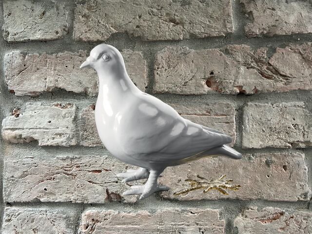
The result? A bold new identity developed with Uncommon Creative Studio and 33 Londoners from across the city. The standout feature is a pigeon logo, cast from London clay, paired with a glittery “splat.” Both funny and deeply symbolic, it reflects the city’s gritty/glorious duality.
Museum Director Sharon Ament explains:
“Our pigeon, cast from London clay, and its splat, rendered in glitter, prompts people to reconsider London. The pigeon and splat speak to a historic place full of dualities, a place where the grit and the glitter have existed side by side for millennia. We share our city with others, including millions of animals. Pigeons are all over London and so are we”
This rebrand worked because it started with people’s lived experience. It didn’t prescribe meaning: it listened first, and designed second.
%20(10).png)


.png)
.png)

.svg)